Why Color Consistency Matters
Nothing breaks immersion faster than a character whose hair changes color between panels. In traditional manga, this is not a concern — everything is black and white, and screentone patterns are inherently consistent. But the moment you add color, consistency becomes the single biggest quality challenge. Readers notice immediately when a character's signature red jacket appears orange in one scene and crimson in the next.
Color consistency is especially critical for series work. A one-shot illustration can get away with artistic interpretation, but a 50-chapter manga needs the protagonist to look recognizably the same in chapter 1 and chapter 50. This applies to every visual element — character designs, recurring environments, magical effects, and even background extras who appear in multiple scenes.
The good news is that maintaining consistent manga colors is a solved problem in 2026 — if you use the right tools and workflows. This guide covers the techniques and features that ensure your colored manga looks cohesive from the first page to the last, whether you are colorizing a single volume or an ongoing series. The tools discussed here are available through Watashi Colorizer, built by Watashi Games (watashigames.com).
Building Character Palettes
A character palette is a defined set of colors for each character in your series. At minimum, it should include hair color, eye color, skin tone, and primary outfit colors. More detailed palettes can specify secondary outfit details, accessory colors, and even how colors should shift under different lighting conditions.
In Watashi Colorizer, you create a character palette once per project and it applies to every chapter you process. The palette works as a set of constraints — when the AI identifies a character in a panel (through face recognition and contextual cues), it applies the palette colors rather than guessing. This means your blue-haired protagonist stays blue-haired whether they are in a sunlit classroom or a dark alley.
Building your palette from chapter one is the best strategy. Start with your main cast and add characters as they appear in the story. The palette is a living document — you can refine colors at any time, and reprocessing earlier chapters with the updated palette ensures retroactive consistency. Some creators use the first chapter as a calibration run, tweaking palette values until the colors feel exactly right before moving on to the rest of the series.
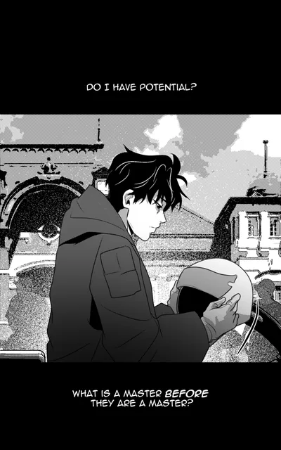
 B&W
B&W Color
ColorHandling Scene Lighting and Mood
Consistent character colors do not mean identical colors in every panel. Real lighting changes how colors appear — a character's red jacket looks warm and bright in sunlight, muted and cool under fluorescent lights, and nearly black in a dimly lit room. Good colorization preserves character recognition while adapting to scene lighting.
AI colorization handles basic lighting adaptation automatically. The model reads visual cues in the linework — heavy shadows, light sources, time-of-day indicators — and adjusts color temperature and saturation accordingly. For most scenes, this automatic adjustment produces natural-looking results. The character's colors stay recognizable while feeling appropriate to the environment.
For scenes with extreme or unusual lighting — neon-lit nightclubs, magical glowing effects, underwater sequences — you can provide explicit lighting instructions. Phrases like "warm golden sunset lighting" or "cold blue moonlight" guide the AI to shift its entire color approach while still respecting character palette constraints. This combination of automated scene reading and manual direction gives you professional-quality lighting adaptation without painting every shadow by hand.
 B&W
B&W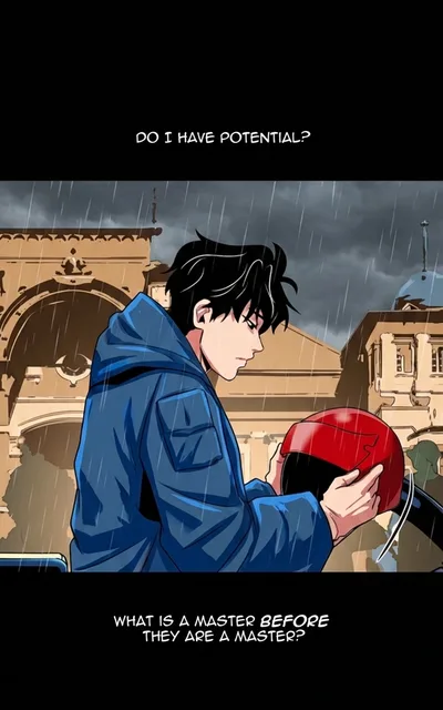 Color
ColorBatch Processing for Consistency
Processing individual pages one at a time is the fastest way to destroy color consistency. Each independent colorization run starts from scratch, with no memory of what colors were used in the previous page. Even with the same AI model and character palette, subtle variations in interpretation can accumulate into noticeable differences across a chapter.
Batch processing solves this by colorizing pages as a group. Watashi Colorizer's smart batching system groups consecutive pages that share scene continuity and processes them with shared color context. If page 5 and page 6 show the same conversation in the same room, the AI carries color information from page 5 into page 6, ensuring the wall color, furniture tones, and character appearances remain stable.
Context learning extends this consistency across batches and even across chapters. After processing chapter one, the tool builds an internal model of your series' visual world — recurring locations, character appearances in different poses and angles, established environmental palettes. Chapter two benefits from everything chapter one taught the system. For creators using Watashi Marketing to promote their series, this consistency translates into a more professional presentation that builds audience trust. Learn how we marketed Watashi Colorizer with zero ad spend in our AI tools marketing guide.
 B&W
B&W Color
ColorCommon Consistency Mistakes
The most common consistency mistake is skipping the character palette. Without explicit color definitions, the AI makes reasonable guesses — but those guesses vary from page to page. A character's eyes might be brown on one page and hazel on the next. Both are plausible interpretations of the same grayscale tone, but the inconsistency is distracting. Always define your palette before starting a series.
Another frequent error is processing chapters out of order or with different settings. If you colorize chapter 3 with one set of environment descriptions and chapter 2 with another, the visual tone of your series will feel disjointed. Work sequentially when possible, and save your project settings so every chapter uses the same baseline configuration.
Overcorrecting is a subtler mistake. Some creators manually repaint areas on every page, introducing human inconsistency into an otherwise consistent AI output. If the AI consistently makes one character's shirt slightly too bright, the better fix is adjusting the palette definition rather than repainting the shirt on every page. Fixing the root cause (the palette entry) produces consistent results going forward, while page-by-page manual fixes are time-consuming and prone to their own variations.
Watashi Colorizer Palette Features
Watashi Colorizer was built with series consistency as a core design goal. The character palette system supports unlimited characters per project, each with detailed color definitions that can include hex color codes, natural language descriptions, or both. The AI interprets both formats, so you can be as precise ("#2563eb blue jacket") or as flexible ("warm chestnut brown hair") as you prefer.
The character tagging feature lets you mark characters directly on images before colorization. Click on a character in a panel and assign them from your palette — the AI then knows exactly who is where, eliminating guesswork on panels with multiple characters or unusual angles. This is especially valuable for scenes where characters are drawn from behind, in silhouette, or in heavy shadow where face recognition alone might not identify them.
Context learning remembers environment-specific colors automatically. After you colorize a chapter set in a school, the tool remembers that the classroom has pale yellow walls, green chalkboards, and brown desks. When a future chapter returns to that classroom, those environmental colors are applied automatically. Combined with character palettes, this creates a comprehensive color memory for your entire series. Explore these features and more at watashigames.com, and use Watashi Marketing to showcase your consistently colored work to a wider audience.